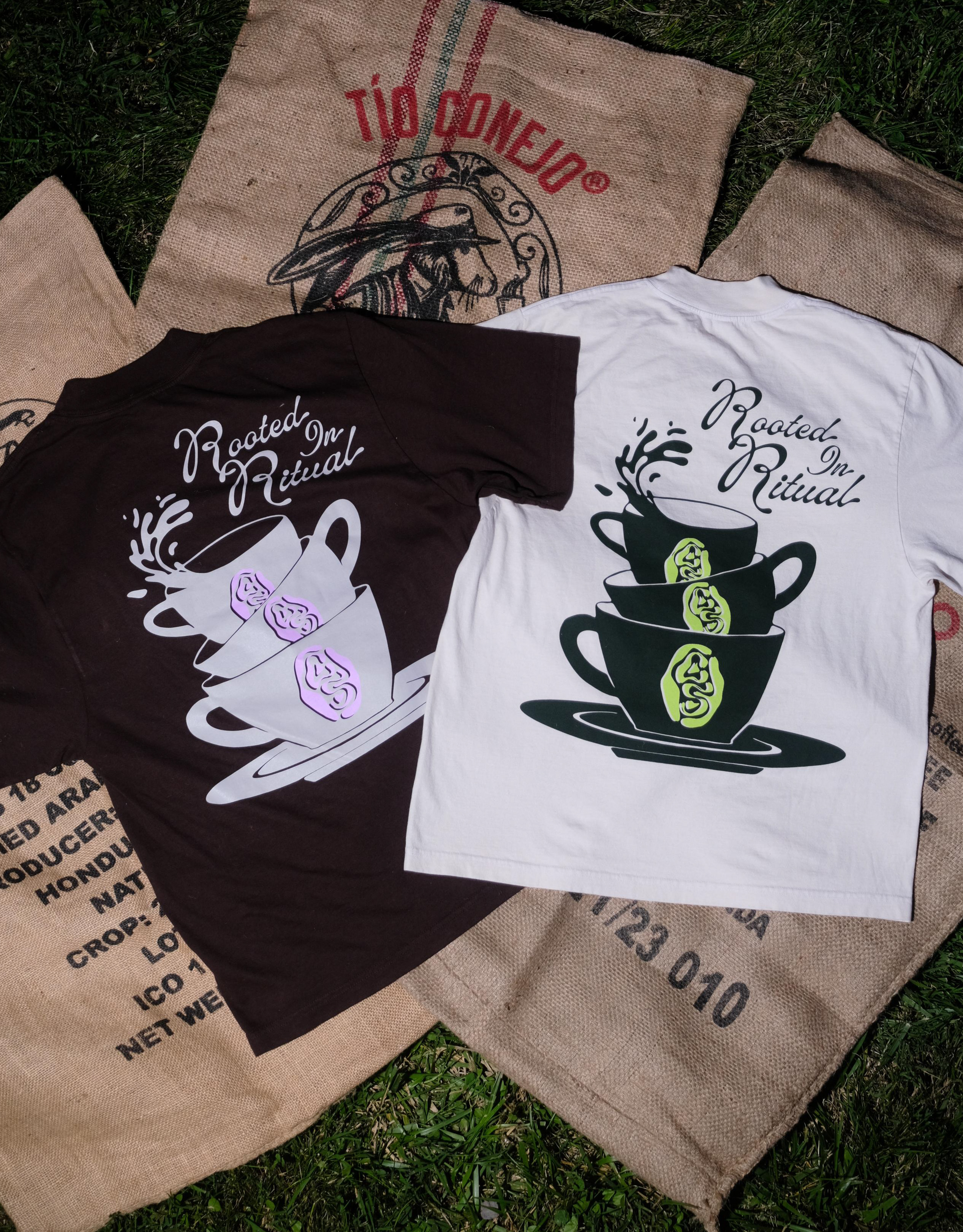
Coffee Sunday is more than just an organization; it’s a vibrant community that celebrates the transformative power of coffee to promote health and well-being.

Overview

Rooted in the rich traditions of communal coffee gatherings from Ethiopia and the western Arabian Peninsula, Coffee Sunday invites those to experience the warmth and connection that coffee brings. By centering the voices of the BIPOC and queer community, they redefine what wellness looks like, creating a welcoming space where creativity, movement, and the love of coffee come together. In Baltimore and beyond they unite coffee enthusiasts and health-conscious individuals to explore the beautiful fusion of coffee and wellness, forging connections and inspiring change, one cup at a time.


Challenge

Crafting a visual identity for Coffee Sunday was a challenge that involved honoring its roots while marking a new chapter in its evolution. The aim was to create an identity that not only captured the expressive spirit of the community but also emphasized its role as a trusted source of wellness within BIPOC and queer spaces. Collaborating closely with founder, Jameer Robinson, we aimed to balance the existing organic feel with a refined aesthetic that resonates deeply with its audience, ensuring this official launch lays a sustainable foundation for Coffee Sunday’s future.
ROLE:  Designer, Art Direction
Photography: Jameer Robinson
CLIENT: Coffee Sunday
Staying true to the original logo's roots, a distinctive typographic wordmark was crafted. Inspired by the organic shapes of swirls and liquid associated with coffee. The goal was to simplify the design while preserving its organic essence. At its core, Coffee Sunday is a space for connection and community. While rooted in coffee, the brand extends beyond that, blending elements of wellness to foster warm communal experiences and provide insights into personalized wellness journeys. Therefore, it was essential for the logo to be versatile enough to resonate in spaces that may not always be coffee-related.

L: before | R: after

Behind the Mark

In developing a secondary mark that complements the distinctive wordmark, the aim was to create a design that feels grounded yet reflects the essence of the brand, especially when the primary logo isn't in view. Through research into the coffee roasting process, an intriguing parallel emerged: raw coffee beans, while unique, only reveal their true flavor through roasting. This transformation resonates deeply with Coffee Sunday’s mission to support self-discovery and celebrate unique identities through community & wellness within BIPOC and queer communities.

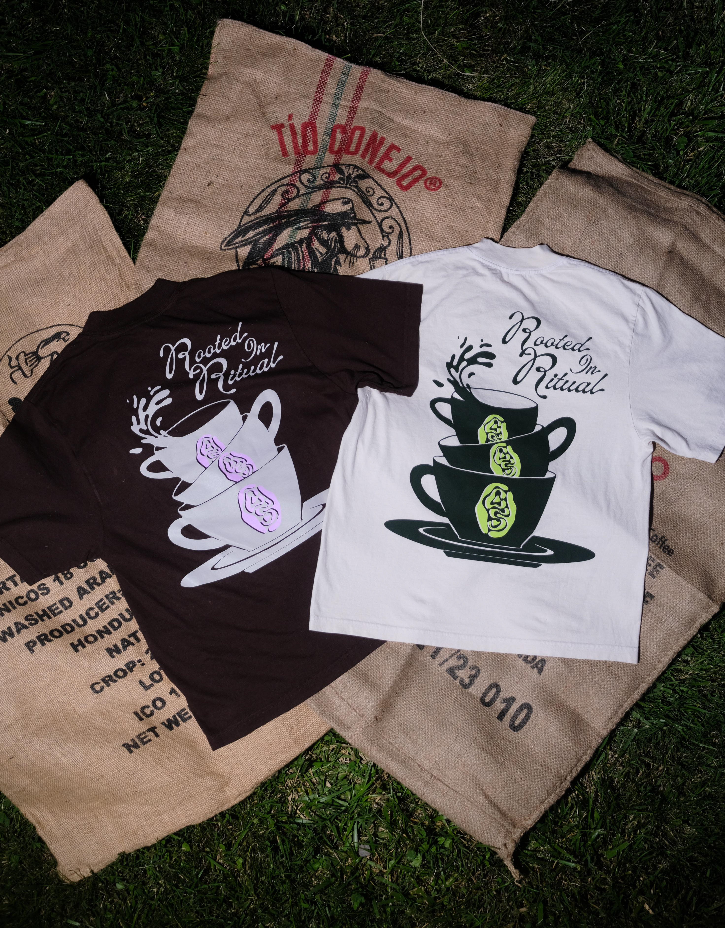
Inspired by this concept, the coffee bean was conceptualized to illustrate the roasting process, complete with its characteristic "two cracks." To add depth, the letters "C" and "S" from the primary logo were integrated into these cracks, symbolizing the brand’s core identity while evoking the richness of flavor that comes from transformation.
Typography & the Color Palette

Pairing typography with the personality of the primary logo presented a unique challenge. To achieve the right balance, Utile was integrated, adding a sense of grounding and sophistication to the overall look.

For the color palette, the aim was to develop an earthy tone scheme that felt both refined and adaptable, allowing for moments of vibrancy and playfulness. The primary palette drew inspiration from the rich browns, greens, and creams found in coffee, while a selection of playful secondary colors was introduced to inject fun into social media and printed materials. This combination ensures versatility and aligns with the brand's dynamic identity.
Let's Not Think About Monday

With the brand's visual identity in place, it was time to put it into action at Coffee Sunday’s inaugural event. This gathering celebrated relaxation, restoration, and positive vibes, featuring collaborations with local businesses and community members in Baltimore. The day kicked off with a short run highlighting nearby cafes, while those preferring a different approach to wellness could engage in various activities.

Attendees enjoyed a workshop led by local fashion entrepreneurs Jasmin Nessa Ali of Nessa the brand and Akia Jones of The Bmore Brand. Following the workshop, founder Jameer Robinson set the mood with a DJ set, allowing guests to unwind with snacks and a curated drink menu from Black Acres Roastery. The event wrapped up with a rejuvenating yoga session led by Vanessa Gomez of Flow in the City, concluding with a breath work exercise led by Elyse Preston to set intentions for the week ahead.

A standout feature of the event was the workshop, where I was tasked with creating additional graphics for tees and silk scarves, which participants could later hand-dye from coffee grounds. This portion of the project allowed for  creative exploration, resulting in three unique graphics of varying sizes. The largest design showcased the main logo, creatively formed from the smoke of a coffee cup. A coffee stain graphic was inspired by the beautiful marks left by coffee cups, reminiscent of the latte art atop a well-crafted drink. Additionally, the brand's secondary mark was incorporated as the smallest graphic option, tying in the overall visual appeal of the event.

View more projects

Back to Top